InVisAI Logo

Topics

Visual Analytics

70%

Artifical Intelligence

20%

Policymaking

10%


Key Resources

IEEE Transactions on Visualisation and Computer Graphics

ACM SIGCHI

Other


Introduction

The last year and a half have been busy with interviews, focus group discussions, and co-design activities in which I’ve had the opportunity to engage regularly with stakeholders from different sectors that include health, social care, education, and local and central government. I have come to appreciate the great need for visual analytics in West Yorkshire and the endless opportunities afforded by one of the world’s most powerful data linkages available right here in Bradford .

Having gathered a significant number of requirements, it is now time to get back on track with a strong visual analytics agenda and pilot implementation work to address some of the less demanding requirements while building capacity (both in terms of funding applications and preparing a talent pipeline) for the more complex ones.

To this aim, the InVisAI group will re-launch in June 2022 with an agenda that is geared toward visual analytics that support population health management and policymaking. The group will meet once a month to discuss scholarly articles that are relevant to the research agenda. This year, we will also have short visualisation “sprints” where dummy data will be provided in a hackathon style to group members. Members will be encouraged to brainstorm ideas and develop solutions to visualise these data.

Interested in Joining? Register here


Gallery

This section includes a range of prototypes our group has created recently and will be further updated as the group develops more vis prototypes. DISCLAIMER: Please keep in mind that these are research prototypes so some may have glitches. For any queries, please contact Dr Mai Elshehaly.

Norway

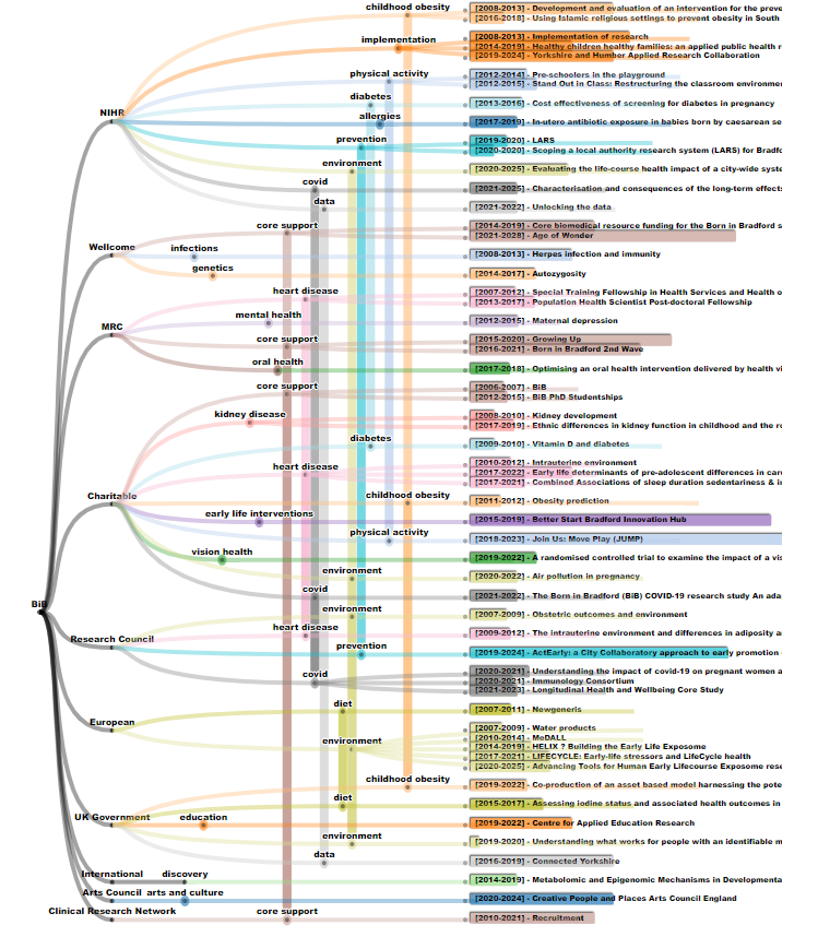
The Born in Bradford (BiB) Family Tree

This visualisation shows funder contribution to the different research themes in the world of BiB. Live demo here

Norway

The Yorkshire and Humber Care Record

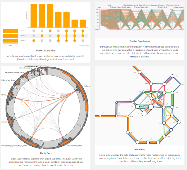
This early prototype was developed for co-design purposes as it shows different set visualisation techniques used to understand cohort intersection. Developed by Smriti Kotiyal and Muhammad Usman. Live demo available upon request.

QualDash Demo

QualDash Demo

QualDash is a dashboard generation engine that aims to support quality improvement in healthcare. You can read details of this work here and explore a live demo (using dummy data) here

lsoa

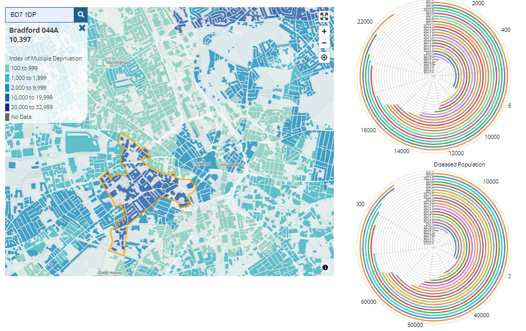
Deprivation in Bradford by LSOA

This is a map visualisation based on the Index of Multiple Deprivation in Bradford. Search for a Bradford postcode (e.g., BD7 1DP) to show data on the map. Live demo here

BiB

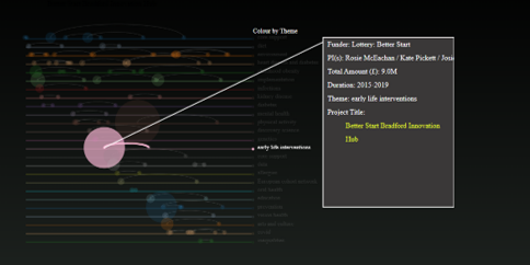
The Born in Bradford Lifeline

This visualisation shows the life span of research themes in the world of BiB. Hover the mouse on a bubble to learn details of the corresponding project. Live demo here

Norway

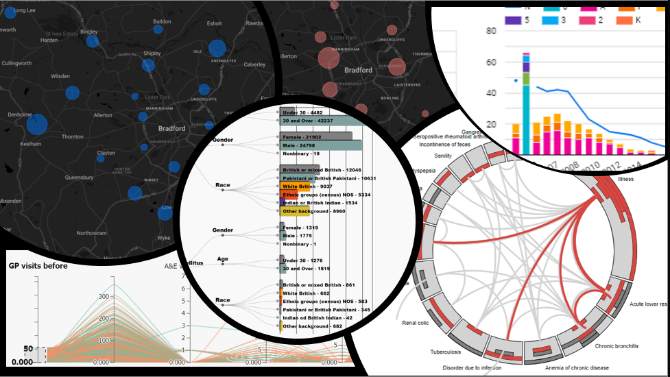
Connected Bradford Preview

Connected Bradford is not a publicly available dataset so this demo is available upon request.


Agenda

Cohort Selection
June 2022 - July 2022

We will explore state-of-the-art in cohort selection and identify key challenges with real-world data.


Vis for Decision Making
July 2022 - August 2022

We will explore the task space in population health management and explore task taxonomies in the VIS literature that can inform this space.


Uncertainty Visualisation
August 2022 - September 2022

We will discuss several visualisation techniques and open research questions on visualising uncertainty.